
5 Interior Design Mistakes To Avoid and What To Do Instead
After years of designing homes around Dublin and beyond, I've noticed that the things that make a room feel "not quite right" are rarely the big-ticket items. It's usually small decisions made early on that look harmless at the time and then quietly undermine everything else.
These are the five things I'd never do in my own home, and what I'd do instead. None of them needs a huge budget. They just need a bit of thought before you commit.
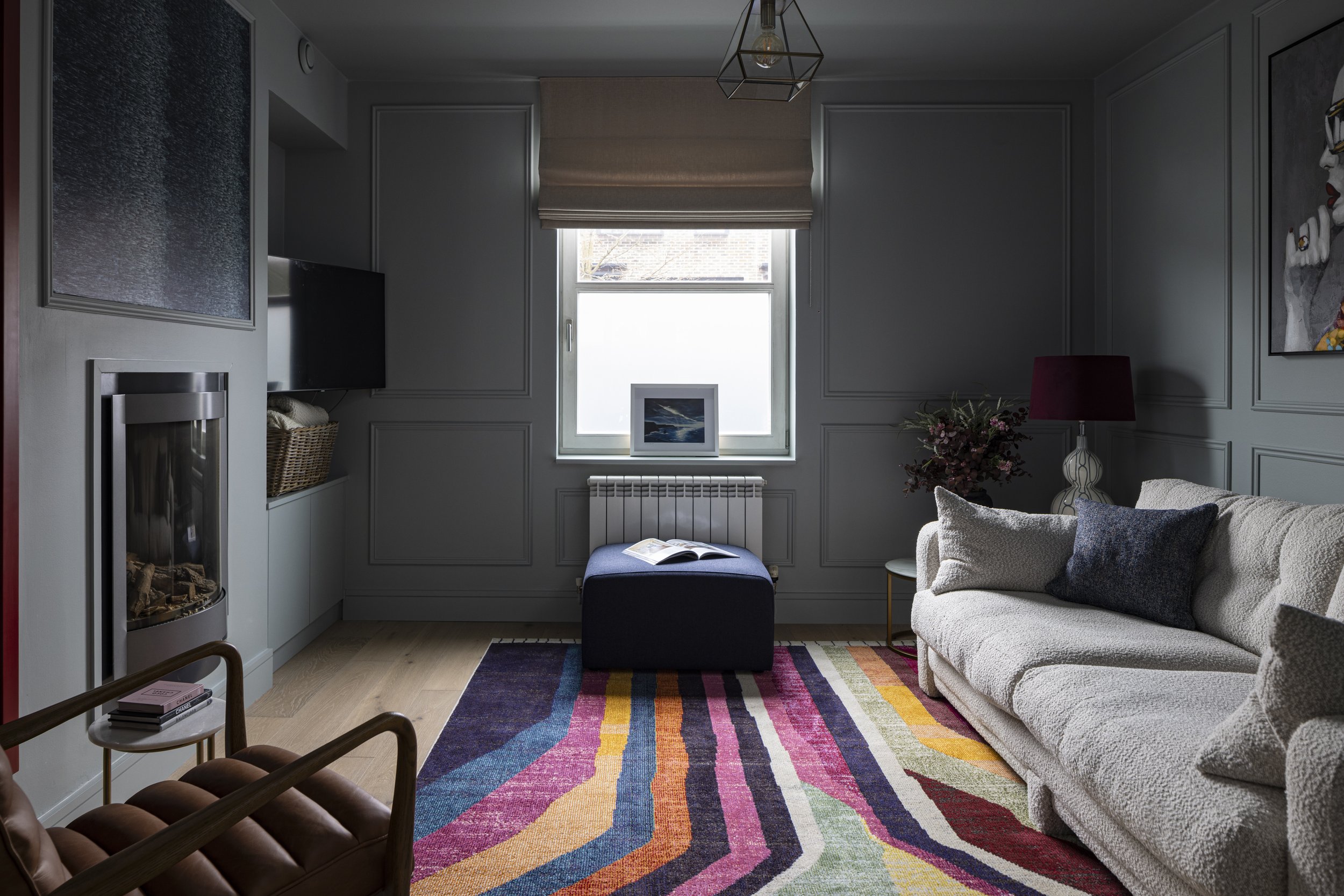
Colour drenched walls, ceiling and woodwork. Living room design by Paula McCarthy Interiors.
1. I would never…paint the ceiling brilliant white by default
Brilliant white is the colour most ceilings get painted without anyone really choosing it. It's on the decorator's van and it's what the ceiling has always been, so on it goes.
The problem is that brilliant white has a cold, almost blue edge, and in Irish light it can look stark and clinical. Next to warmer walls it often looks slightly grey or dingy, which is the opposite of what you want. It also draws a hard line where the wall stops and the ceiling starts, so the room can feel boxier and lower than it is.
What to do instead: think of the ceiling as the fifth wall and give it a colour decision like the others. Some options:
A softened white with a little warmth in it, which sits far more comfortably beside most wall colours.
A paler tint of your wall colour, which blurs the edges of the room and makes it feel calmer and more cohesive.
Colour-drenching: walls, ceiling, woodwork, even radiators in the same colour or tones of it. It sounds bold, but in the right room it's cocooning and surprisingly spacious. It works especially well in bedrooms, snugs and small rooms with no strong architectural features.
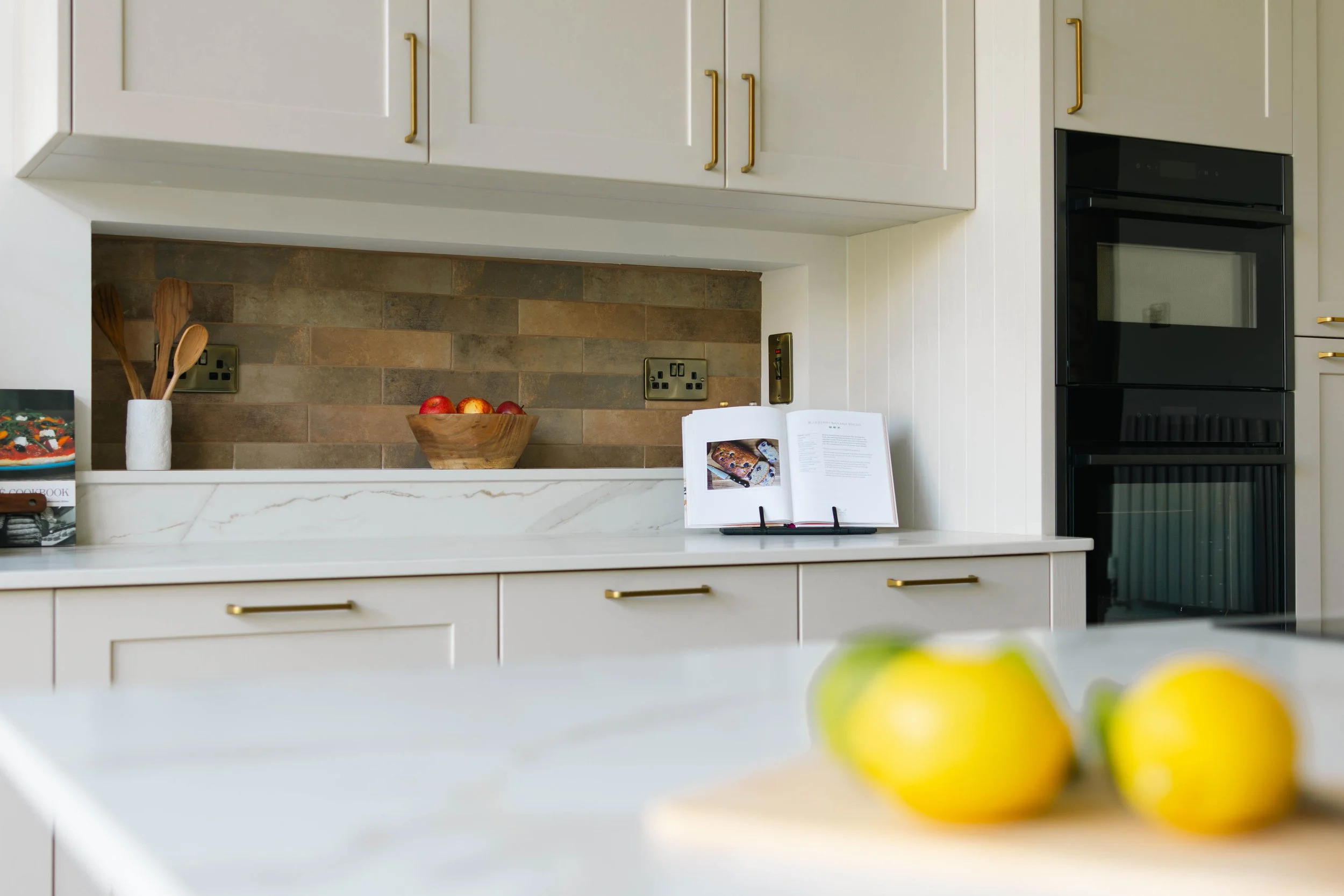
Unlacquered brass handles on kitchen cabinetry. Kitchen design by Paula McCarthy Interiors.
2. I would never…put cheap handles on good joinery
This one goes straight to the budget. You've invested in beautifully made kitchen units or bespoke wardrobes, and then the handles are the thing that gets squeezed at the end.
Handles are the jewellery of a kitchen. They're one of the few parts of a room you physically touch every single day, so you notice their quality far more than you'd expect. Lightweight, hollow or shiny-plated handles can make expensive cabinetry look builder-grade almost instantly.
What to do instead: keep aside a proper portion of your budget for handles and knobs from the start. Look for:
Weight. A solid handle feels reassuring in your hand, and that sense of quality carries into the whole room.
Finishes that age well, like unlacquered brass, bronze and aged or brushed metals, which develop character instead of chipping.
Proportion. Handle size should suit the door or drawer. Longer pulls on larger drawers look considered, and tiny knobs on big doors look like an afterthought.
If the budget is truly tight, swapping handles is also one of the most effective quick upgrades for an existing kitchen.
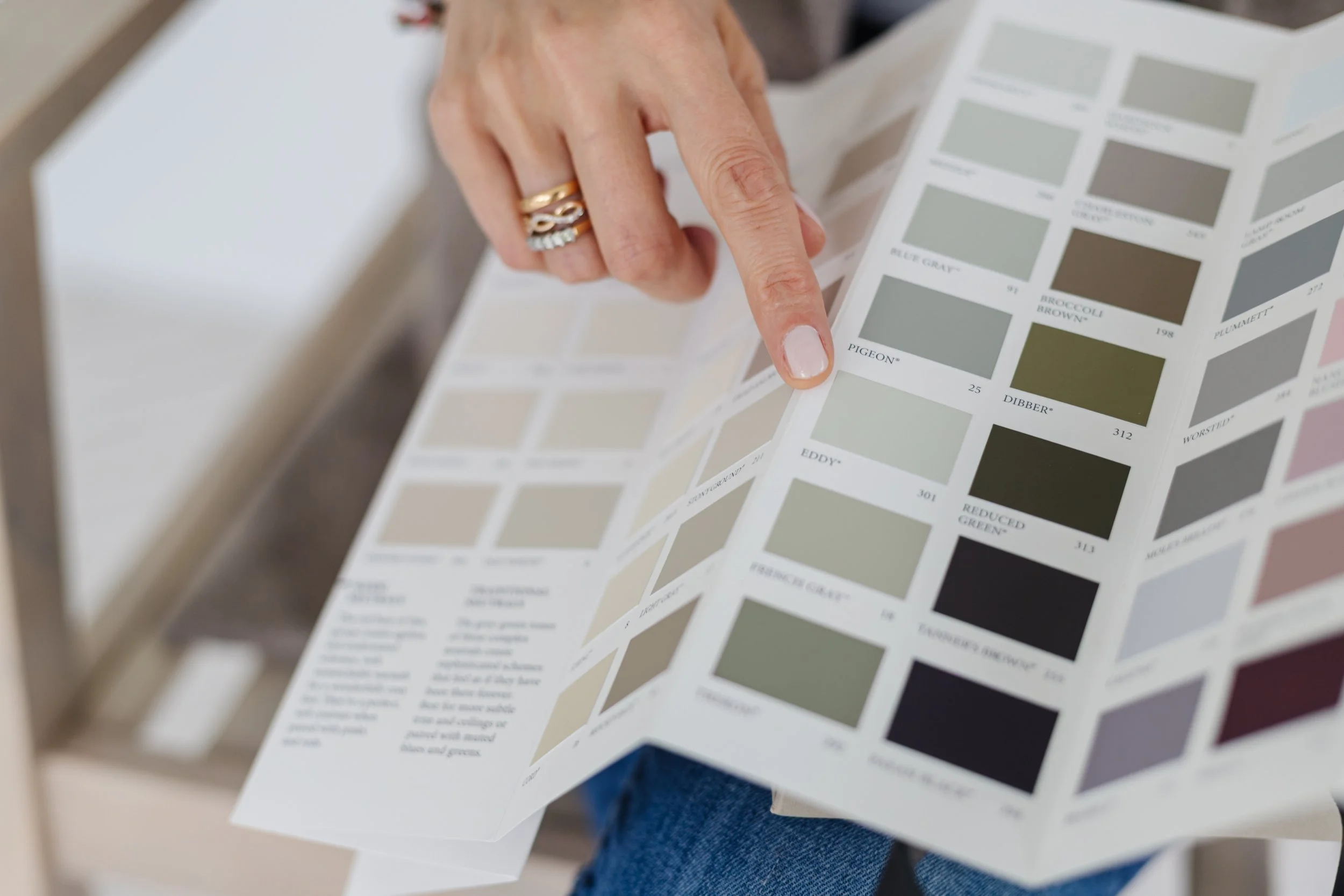
Credit: Paula McCarthy Interiors
3. I would never…pick paint from a tiny swatch in the shop
A colour chip the size of a stamp, viewed under bright shop lighting, tells you almost nothing about how that colour will look on your walls. Colour shifts dramatically with the amount of light, its direction and what's around it. That's why the "perfect greige" so often ends up looking lilac, green or muddy once it's on.
Here in Ireland this matters even more. Our light is soft and often grey, and north-facing rooms in particular get a cool, flat light that pulls colours colder. A south-facing room might make the same shade look warm and golden.
What to do instead:
Paint large sample boards, A3 or bigger, with two coats. Avoid painting patches straight onto your existing wall, because the old colour around them distorts how you see the new one.
Move the boards around the room: beside the window, on the darkest wall, next to your flooring and fabrics.
Look at them morning, afternoon and evening, including under your own lamps at night, because that's when you'll use most rooms.
Live with them for a few days before deciding. The right colour is usually the one you stop noticing, in a good way.
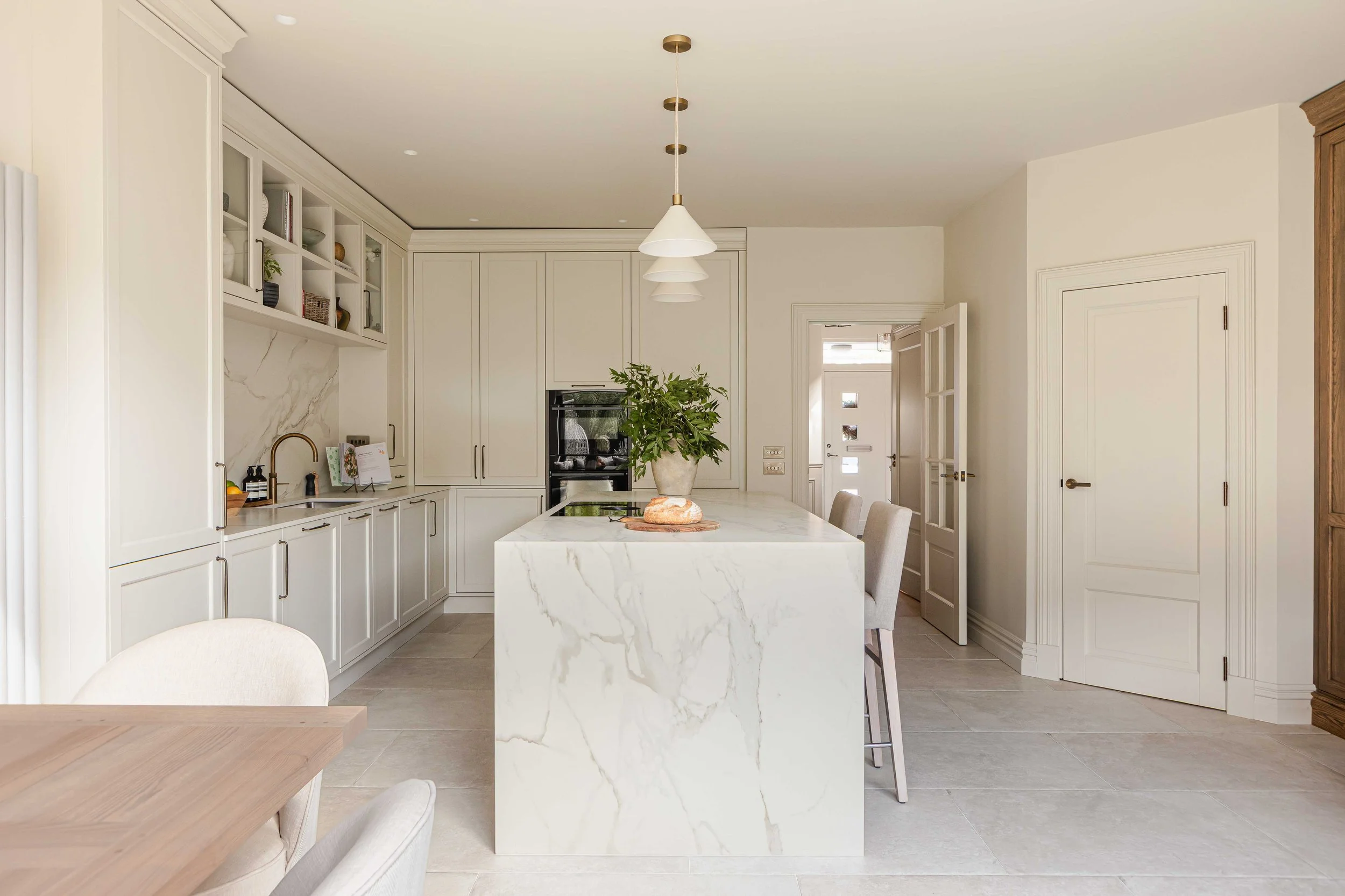
Minimal ceiling spotlights which are recessed for softer light. Island pendants, over counter and in cabinet LED lights are preferred. Kitchen design by Paula McCarthy Interiors.
4. I would never…add spotlights in every room
Recessed spotlights have become the default in so many renovations. A neat grid across every ceiling seems practical and modern, but the result is often flat, even light that makes a home feel more like an office or a shop. It also leaves the ceiling dotted with holes, which isn't the look anyone is going for.
Light coming only from overhead tends to cast shadows in the wrong places and leaves no cosy corners in the evening, which is when we most need our homes to feel warm.
What to do instead: use spotlights only where they have a real job to do, such as over kitchen worktops, in hallways and circulation spaces, or in a shower. Everywhere else, and especially in living rooms and bedrooms, layer your lighting:
Ambient light: a pendant or ceiling fitting for general light - although I would add this for decoration, not as an actual light source.
Task light: reading lamps, under-cabinet lights, desk lamps.
Accent light: picture lights, wall lights, a lamp on a sideboard.
Aim for several light sources at different heights, choose warm-white bulbs, and put as much as you can on dimmers. It's the single biggest difference between a room that looks good in photos and one that feels good to sit in.
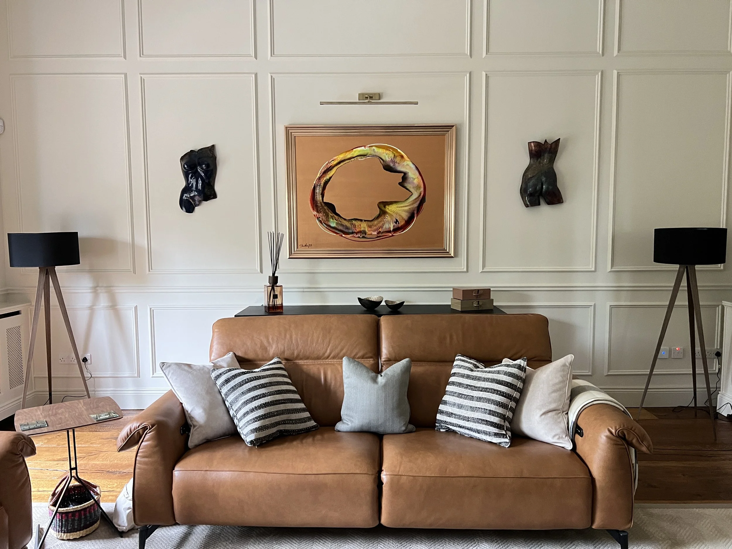
Centre of art piece hangs approx 150cm from the floor. Living room design by Paula McCarthy Interiors.
5. I would never… hang art or photos too high
This is one of the most common things I see in homes. Pictures float up near the ceiling, disconnected from the furniture and from the people in the room. It makes walls feel emptier and ceilings feel lower, and the art itself gets lost.
What to do instead:
Hang at eye level. A good rule of thumb is to put the centre of the piece roughly 145–150cm from the floor. Keep that consistent through a room or down a hallway and everything will feel more considered.
Relate art to the furniture below it. Above a sofa, sideboard or bed, leave a gap of about 25cm between the top of the furniture and the bottom of the frame, so the two read as one arrangement.
Treat groupings as a single piece. For a gallery wall or a cluster of family photos, lay the arrangement out on the floor first, then hang it so the centre of the whole group sits at that same eye-level height.
The common thread
Each of these comes down to the same idea: make deliberate choices rather than defaulting to what's quickest or most common. A considered ceiling colour, good handles, properly tested paint, layered lighting and well-hung art won't cost the earth, but together they're what makes a home feel finished.
Planning a renovation or refreshing a room? I help homeowners across Dublin get these decisions right the first time. Take a look at my design services or get in touch to book a consultation.